Solving Enterprise AI Filter Accessibility and Scalability @ Expert.ai
Redesigned core filtering experience to remove accessibility barriers and improve data discovery workflows.

Role
UX Designer
Team
2 PMs
3 Developers
1 Researcher
2 Designers
Time
12 weeks
Skills
UX Research
Wireframing
Prototyping
Design Systems
Tools
Figma
Figjam
Notion
BACKGROUND
GREAT AT LANGUAGE PROCESSING - SO WHY COULDN'T USERS FIND WHAT THEY NEEDED?
Expert.ai serves enterprise clients across healthcare, finance, and government with powerful AI language processing. However, thematic analysis of support tickets showed their filter system created major barriers with drag-and-drop interactions that didn't scale and inaccessible design patterns.
IMPACT
A redesigned, accessible filter experience led to faster task completion, improved data confidence, and reduced user frustration.
28%
Faster task completion reported by users
35%
Improvement in clarity of filtering actions
45%
Reduction in filter-related support tickets
WHAT IS THE EXPERT.AI CORPUS?
Expert.ai Corpus helps enterprises analyze unstructured text data from documents and reports. The platform transforms this information into searchable insights that drive business decisions.
USER WORKFLOW

Upload Data
Upload

Confirm
Define


PROBLEM
WHY WAS THE EXISTING FILTER FAILING USERS?
The original design introduced unnecessary friction at every step—here’s how:

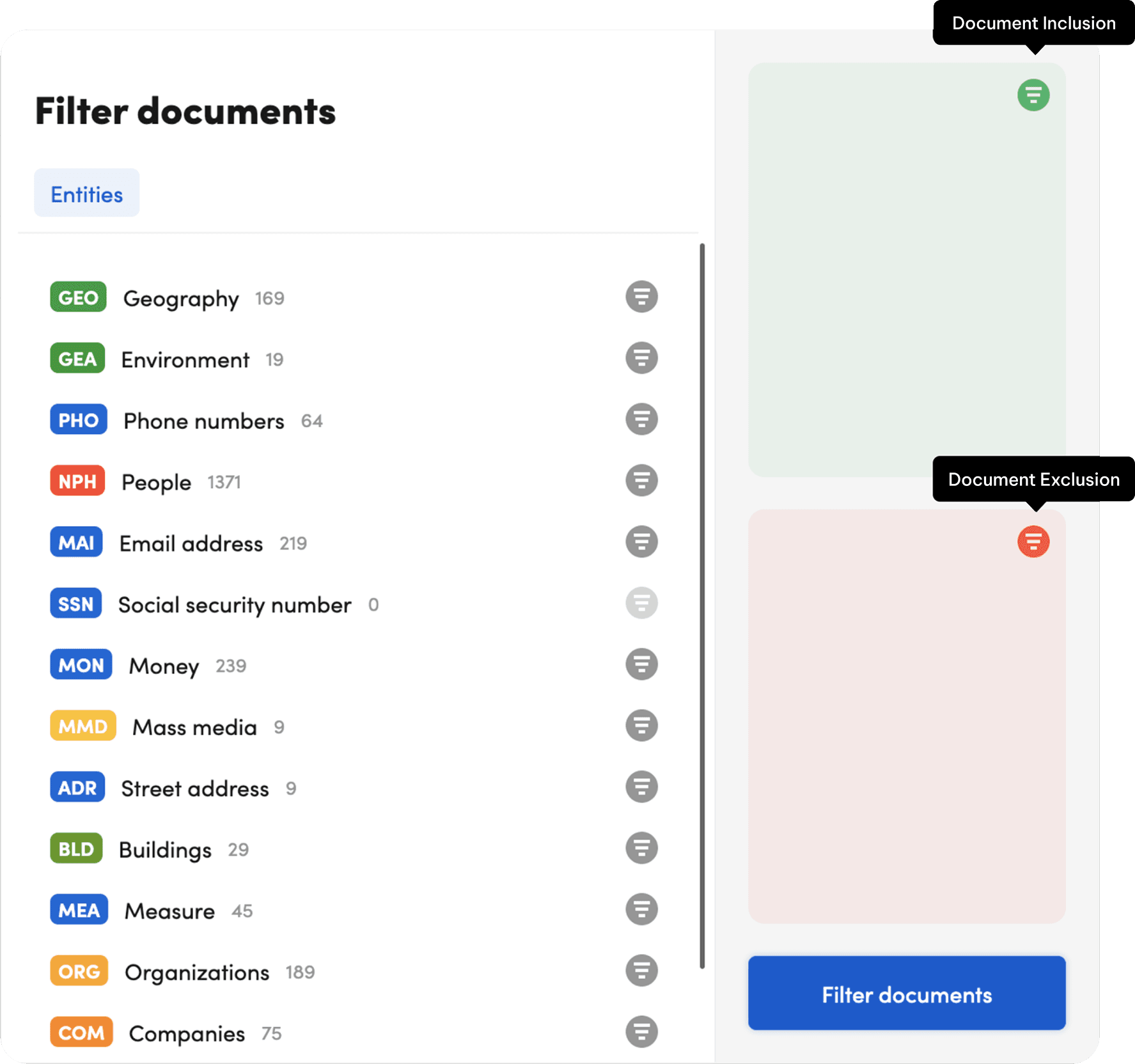
Color-dependent interface excluded users with visual impairments.
Ambiguous icons without labels left users confused about functionality.
Separate filter window blocked users from seeing real-time results.
WHAT HAPPENS WHEN THE TOOL MEAN TO SIMPLIFY YOUR WORK ACTUALLY MAKES IT HARDER?

Clients reported longer-than-expected onboarding times

Support tickets mentioned "frustration with basic tasks"

Some teams continued using manual methods alongside the platform
GOAL
How Could We Transform the Filter Experience?
Redesign the filter to be accessible, scalable, and provide clear feedback for enterprise users across all industries.
RESEARCH
Validating User Pain Points
We went full detective mode - 127 support tickets analyzed, 6 usability tests observed, and 4 in-depth interviews. Every single method showed us the same frustrating filter problems, just from different angles.
Users repeatedly apply filters because results don't match expectations
"I applied the entity filter expecting to see only documents without an entity, but I'm still getting random results."
Users with motor impairments can't complete basic filtering
"The drag-and-drop feature was tedious and excluded people with physical accessibility needs."

ENTERPRISE ANALYSTS
Users needed the manual to complete tasks that should have been intuitive, despite the AI's capabilities.
"Our platform solves information overload but creates interface overload." – Walt Mayo, CEO
Talking to users highlighted key areas where the design was failing them
USER NEED #1
Users with visual impairments need to navigate filters without relying on color alone.
DESIGN IMPLICATION #1
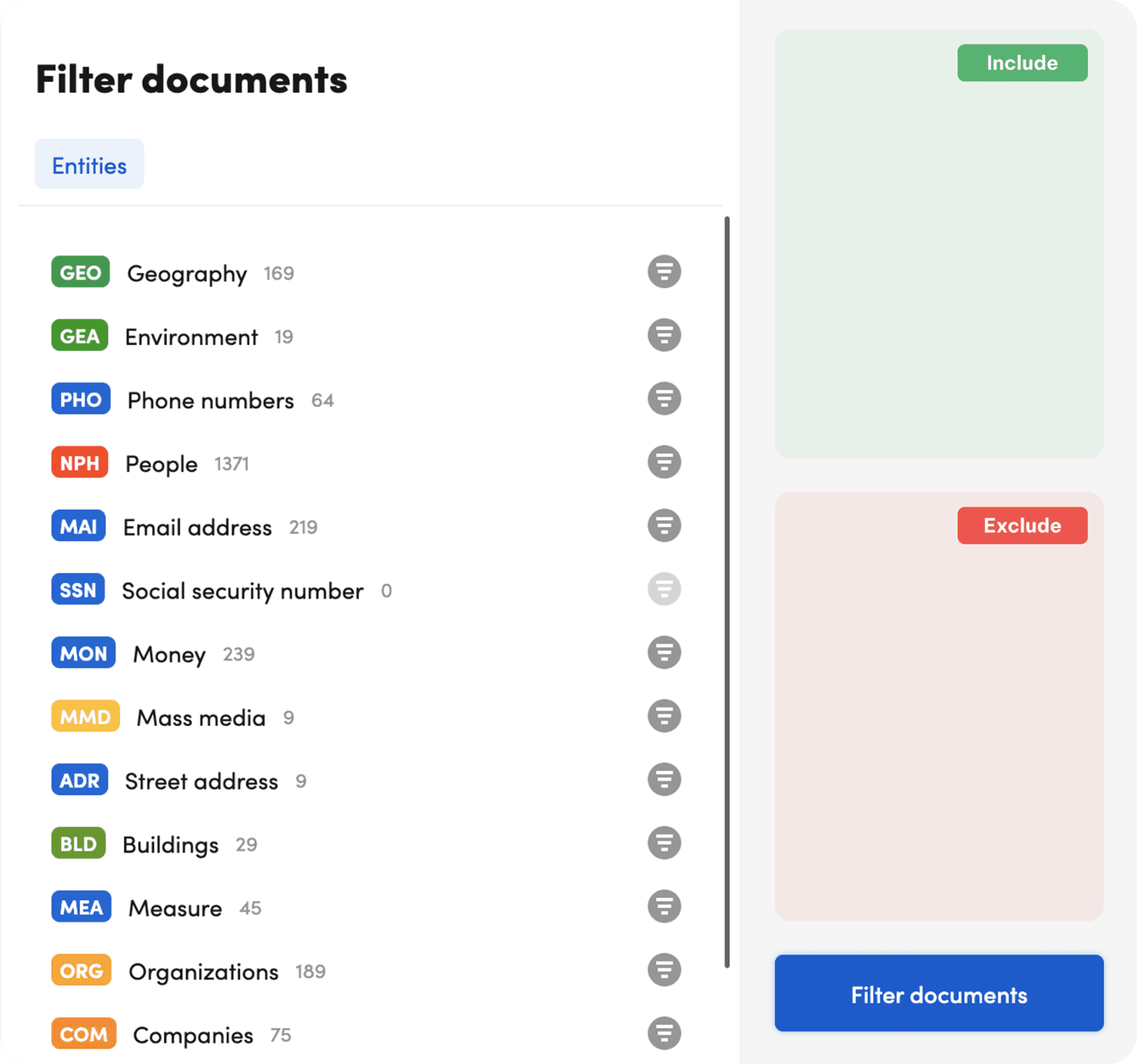
Adopted WCAG colors, ensuring accessibility & maintaining brand identity.
USER NEED #2
Users need to instantly recognize icon functions.
DESIGN IMPLICATION #2
Redesigned icons with universal metaphors and permanent text labels.
USER NEED #3
Users require confirmation their filters are processing.
DESIGN IMPLICATION #3
Added real-time updates and progress indicators during filtering.
DESIGN PROCESS
Trial, Error, and Breakthroughs
We started with conservative tweaks to respect the existing system, but user testing pushed us toward bigger changes. Here’s how the design evolved—and why we ultimately took a riskier approach.
INITAL UI Decisions
Our first approach was cautious—add labels where things were unclear, improve colors that failed accessibility tests. But surface changes couldn't fix the deeper interaction problems.
Design 1: Added pop-up labels to the icons
Maintained brand consistency
Didn’t solve core usability issues
Not WCAG compliant
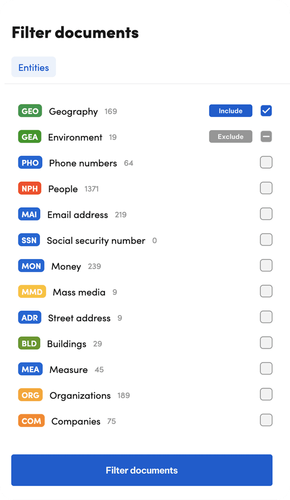
Design 2: Replaced icons with text labels
Reduced learning curve
Ignored interaction pain points
Not WCAG compliant
Checkpoint
Neither version made the cut. While both followed our design system, they didn't solve the core interaction problems users faced daily. This pushed us toward a more radical approach to how filtering could work.
Refined UI Decisions
We realized that small adjustments weren’t enough. To solve the real problems—like accessibility, feedback, and efficiency—we explored two more advanced design concepts. Both removed drag-and-drop and used WCAG-compliant colors, but each offered a different way to improve the experience.
Design 3: Modified to WCAG-compliant colors
WCAG-compliant colors
Kept layout simple and predictable
Users can't see filtering in real time
Required stakeholder approval
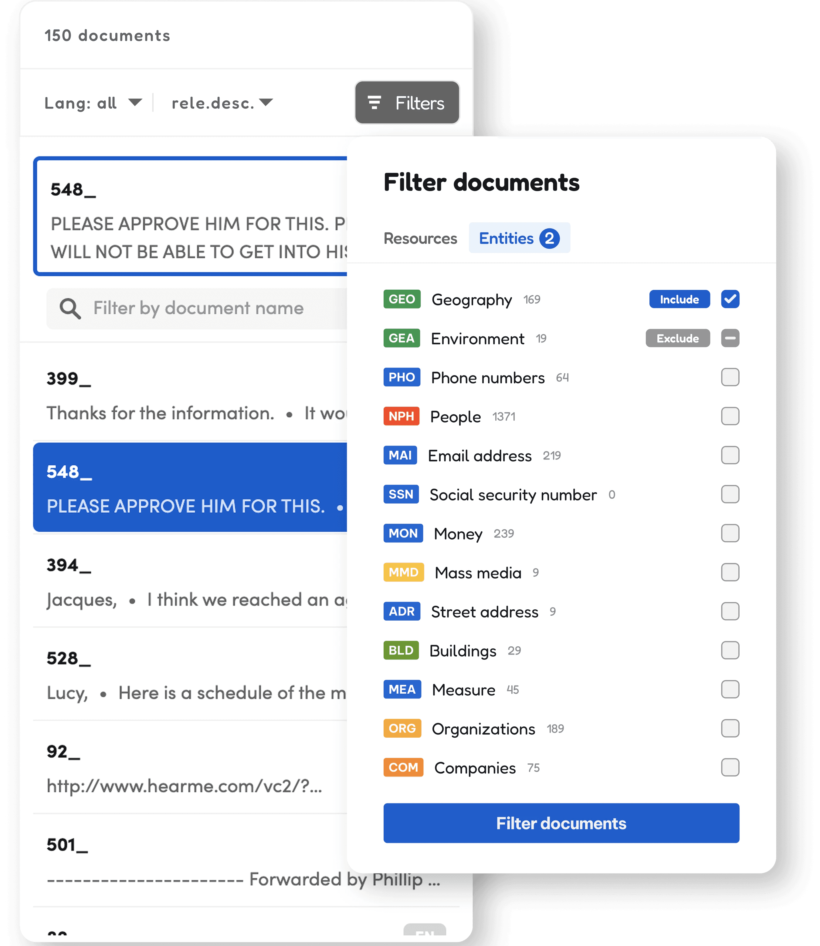
Design 4: Reimagined interaction design
Can see filtering in real time
Addressed root problem w/ drag/drop
Higher engineering costs and timeline
Winner: Design #4
The selected dropdown design improved both accessibility and task flow.
By placing the filter next to the results, users no longer had to switch back and forth. Combined with accessible colors and immediate visual feedback, this solution made filtering fast, intuitive, and inclusive.
Prototyping
Check out this quick video to see the new filter in action—designed to be faster, more intuitive, and easier for everyone to use.
SIGNING OFF
Next steps
We need to test this with actual users to see if our accessibility fixes work as intended. While I didn't get to run these tests due to timing, the results would make a strong case for rolling out the solution company-wide.

Now What?
The work showed that accessibility and business needs don't have to compete. When you design inclusively from the start, you end up with simpler, better solutions that work for more people.
My key take-aways
Instead of fighting limitations, I used them to guide smarter design decisions. That approach led to a filter experience that’s simpler, faster, and more accessible for thousands of users.


