

Overview
Summer 2023 design intern at the DNC, creating on-brand and accessible graphics for the Biden-Harris campaign under high-stakes, tight deadlines.
Role
Digital Designer
Content Designer
Accessibility Advocate
Time
4 months
Skills
Visual Design
Brand Consistency
Accessibility (WCAG
| CONTEXT
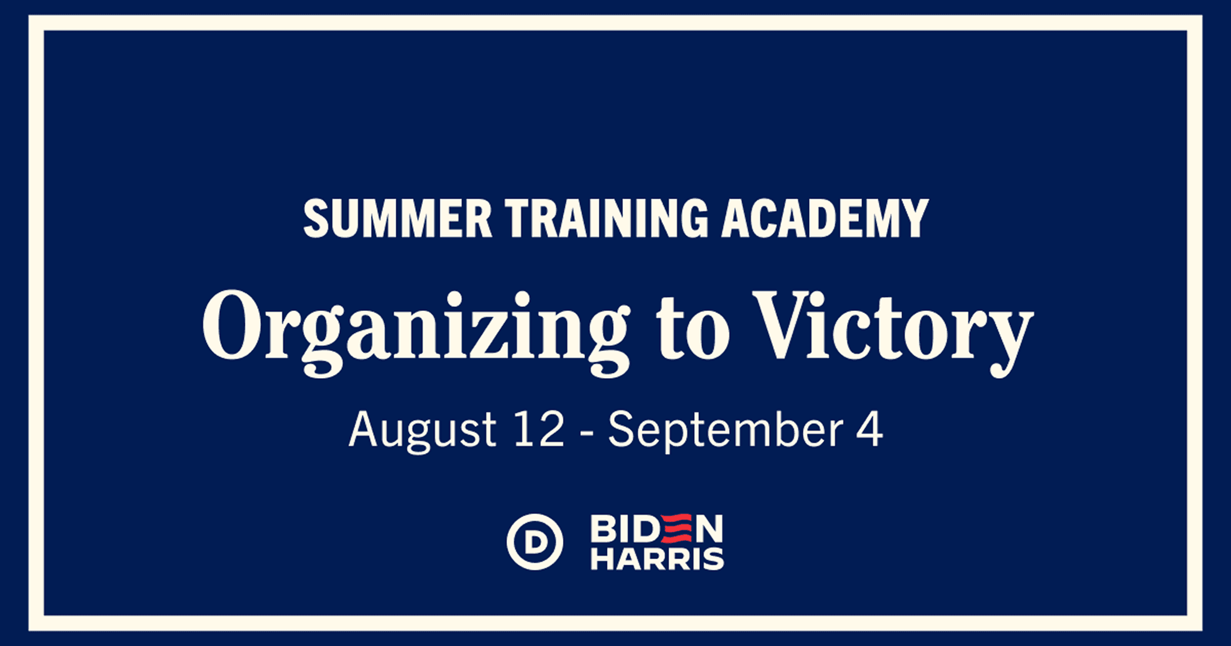
# Summer 2023 at the DNC
I spent the summer of 2023 in Washington D.C. as a Digital Design Intern on the DNC's Mobilization team, creating social media graphics and digital ads for the Biden-Harris campaign and the Democratic party.
The work moved fast. Design requests came in daily, and turnarounds were tight. I'd present options in the morning, receive feedback on Slack, and see the approved design live by afternoon, reaching millions of people.
I joined during the Biden-Harris campaign's brand transition. I was responsible for implementing new visual guidelines while ensuring every design met WCAG accessibility standards. This meant balancing brand consistency with legibility and making judgment calls about photo selection, layout, and contrast.
My work spanned multiple types of assets, each with different requirements and constraints.

| MY ROLE
Wearing Multiple Hats
I designed digital assets from concept to delivery. Each one required visual design, message simplification, and WCAG compliance.
I owned the design decisions: choosing layouts, selecting photos, setting typography, checking contrast. I'd present options on Slack, incorporate feedback, and deliver finals.
Timelines varied from same-day to multi-day projects. The fast-paced environment taught me to make design decisions confidently under pressure.
| DESIGN PROCESS
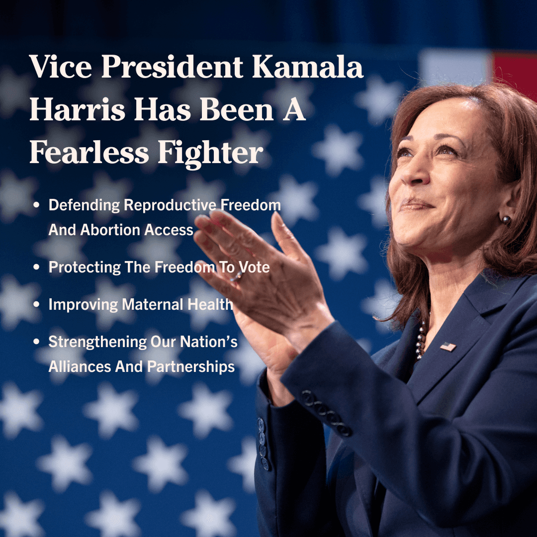
Kamala Harris VP Celebration
I designed many graphics during my internship, each following the same approach: iterate on layouts, validate accessibility, incorporate feedback. This walkthrough focuses on one project to illustrate that process: a graphic celebrating Vice President Harris's anniversary in office.
The assignment was to design a graphic celebrating Vice President Kamala Harris's anniversary in office. The goal: create something that felt celebratory and professional while meeting accessibility standards and implementing the campaign's new brand guidelines.
Setup
Constraints and Challenge
The primary constraint was that all text, including the headline and bullet points, was pre-approved and locked from the Marketing team.
My design challenge was purely visual: I had to select a photograph and create a text layout that was engaging, on-brand, and fully WCAG-compliant for legibility.

Multiple iterations testing photo selection, text layout, and WCAG contrast requirements
My Process
Exploring and Refining
I started by designing multiple versions with different photos and text layouts. I presented the options on Slack to the design director and communications team for feedback.
The critique revealed clear issues. Several iterations failed WCAG accessibility checks—the text contrast against the photos was too low. Others passed accessibility requirements but didn't feel celebratory enough. They looked formal when they should have felt warm.
The feedback gave me a clearer target: find a photo that felt both professional and approachable, with enough contrast to make the text accessible without relying on heavy overlays.
End Result
The Final Design:
After multiple rounds of feedback, the final design landed on a photo that solved both problems: it felt celebratory and provided strong text contrast.
The image showed Vice President Harris mid-speech, active, engaged, warm. The dark background gave me the contrast I needed for accessibility without covering the photo with overlays. The text layout stayed clean and scannable, with clear hierarchy from headline to bullet points.
It met every requirement: on-brand, accessible, and celebratory.
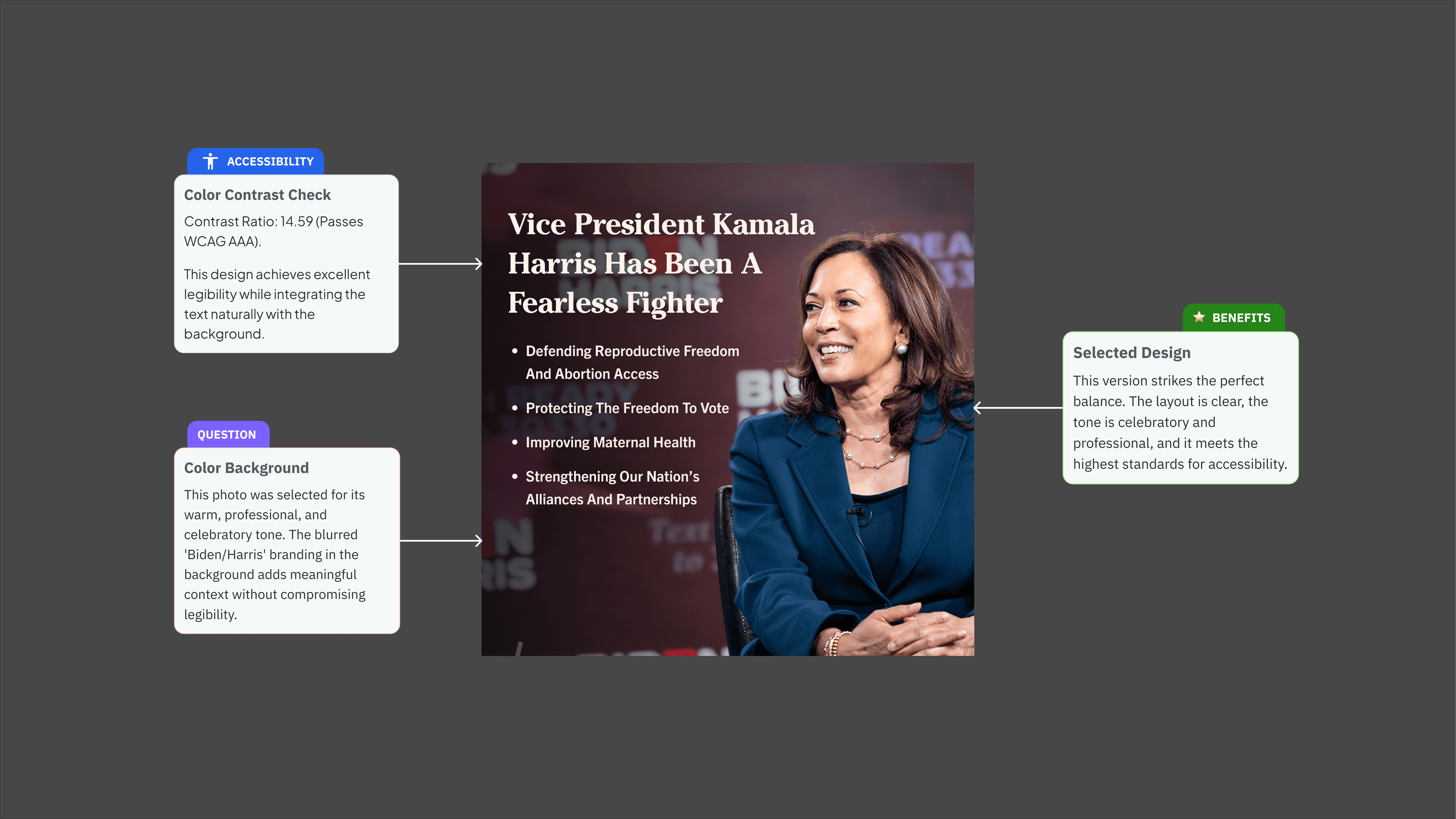
The final design: candid photo, clear text hierarchy, and WCAG-compliant contrast
| FINAL DESIGNS SHOWCASE
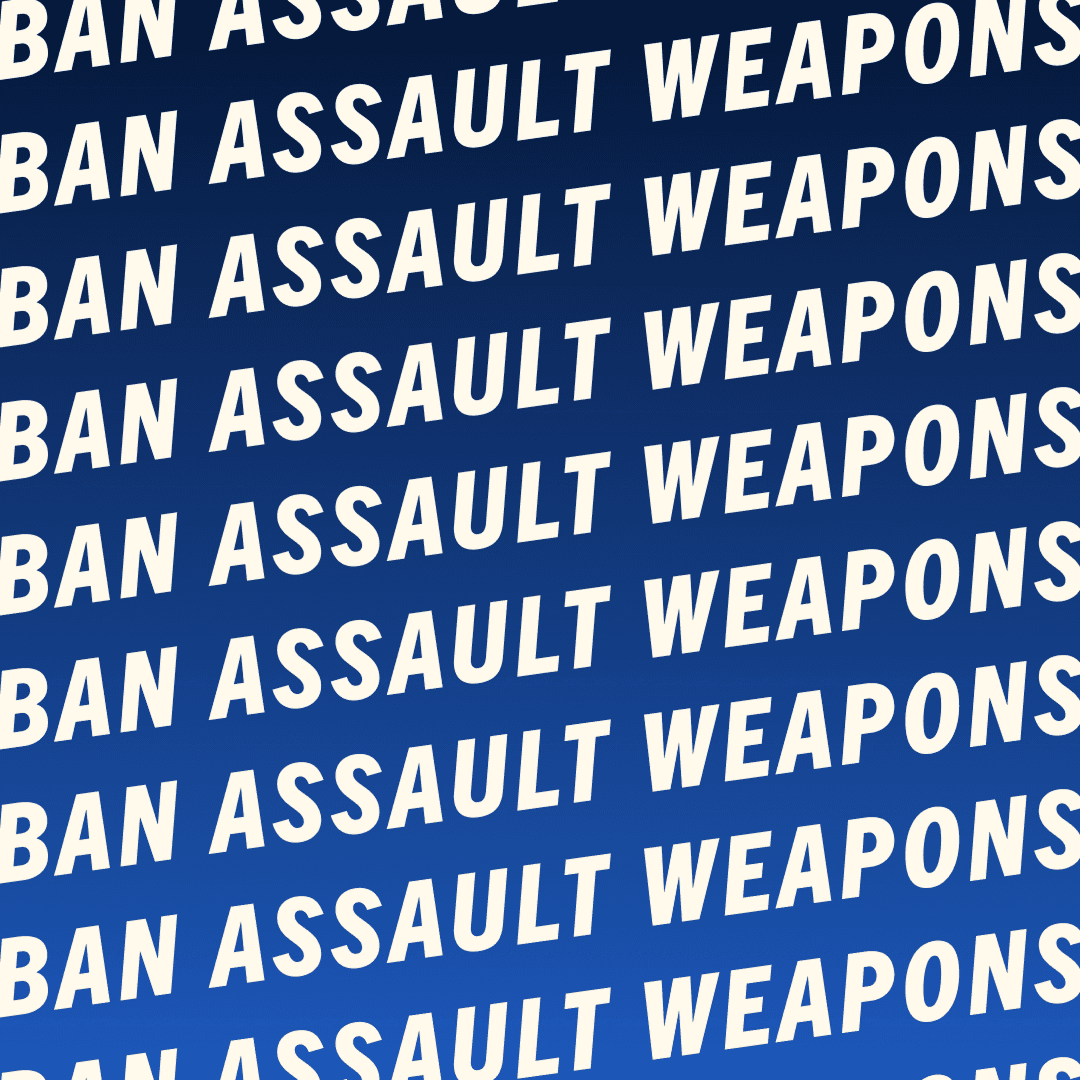
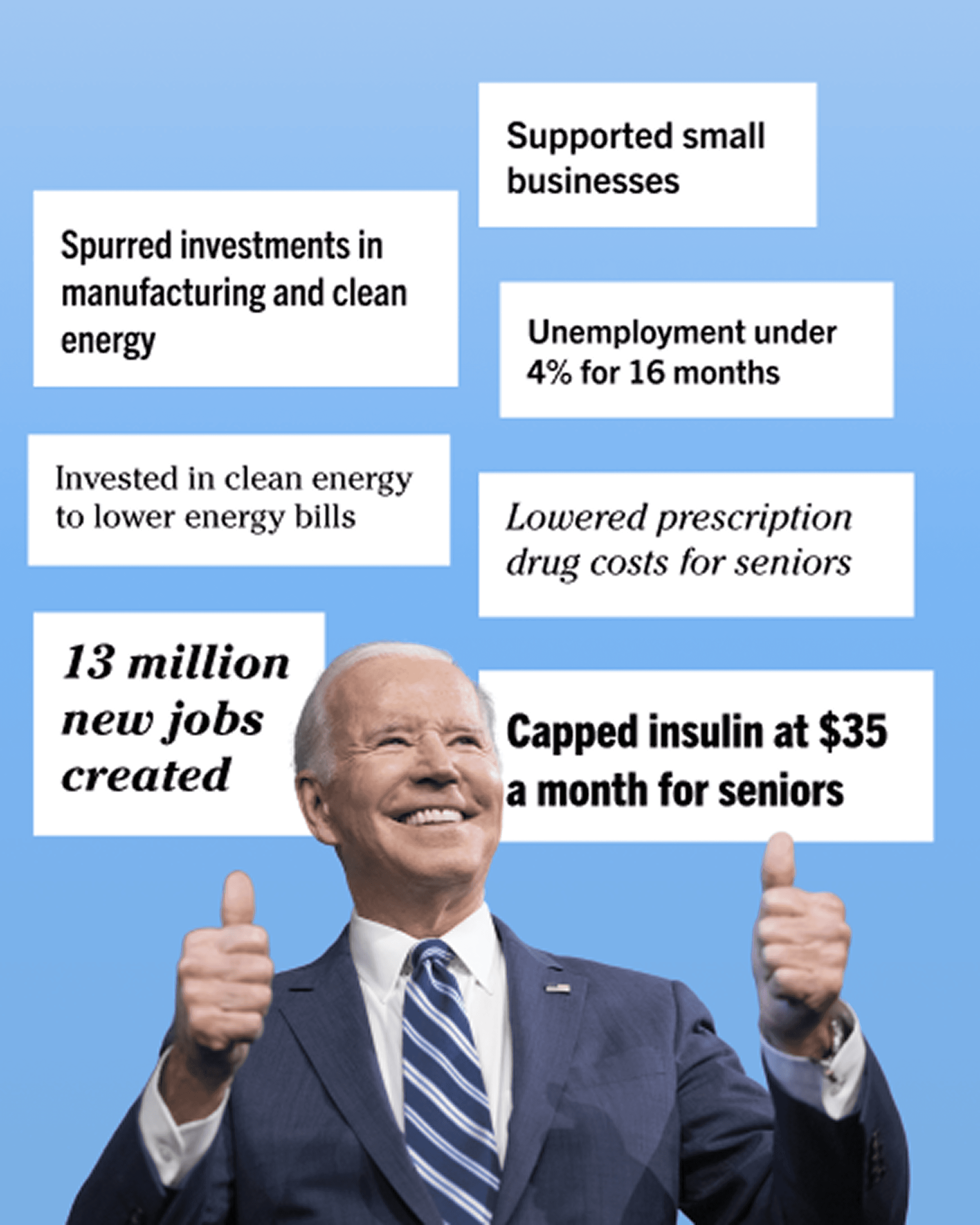
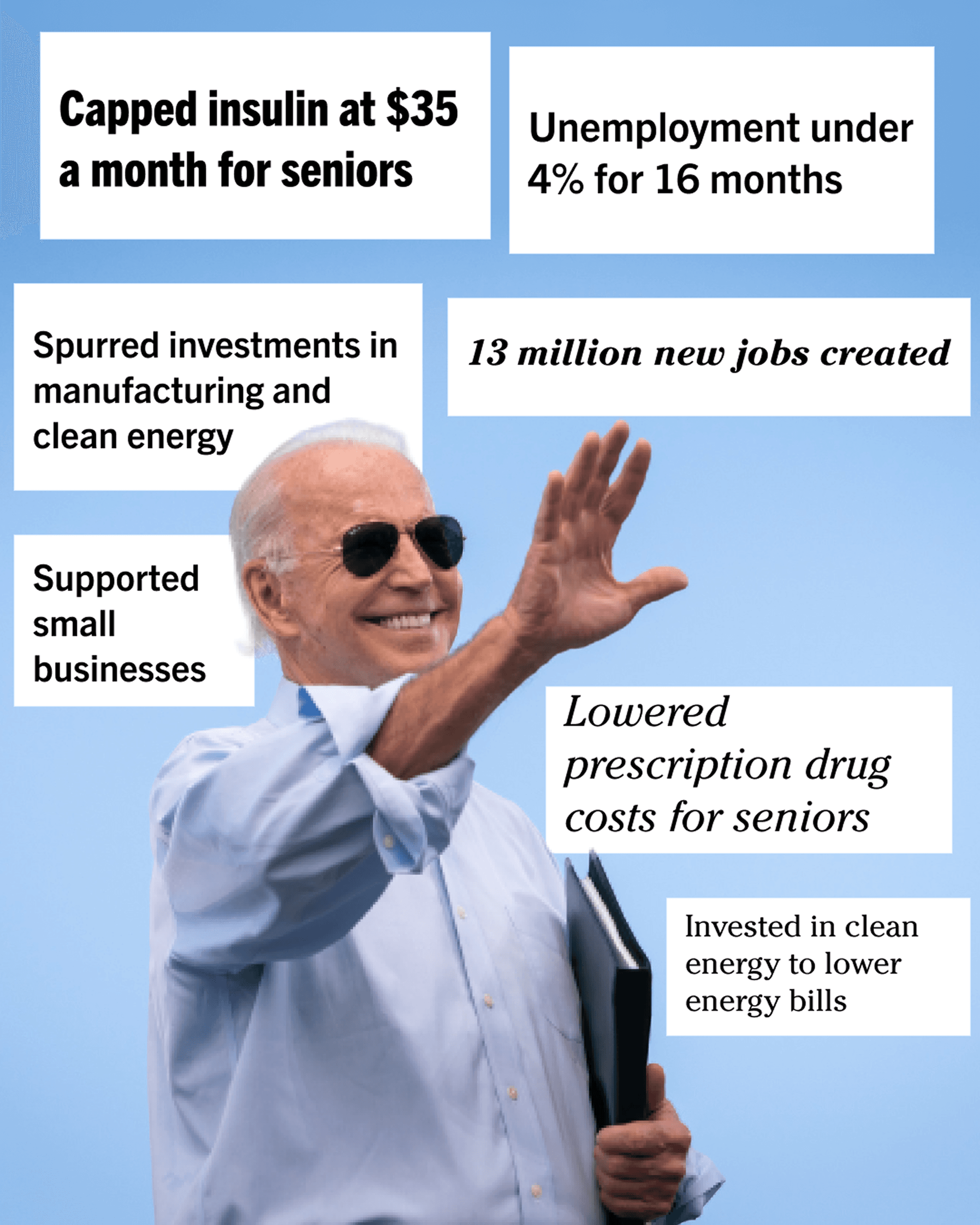
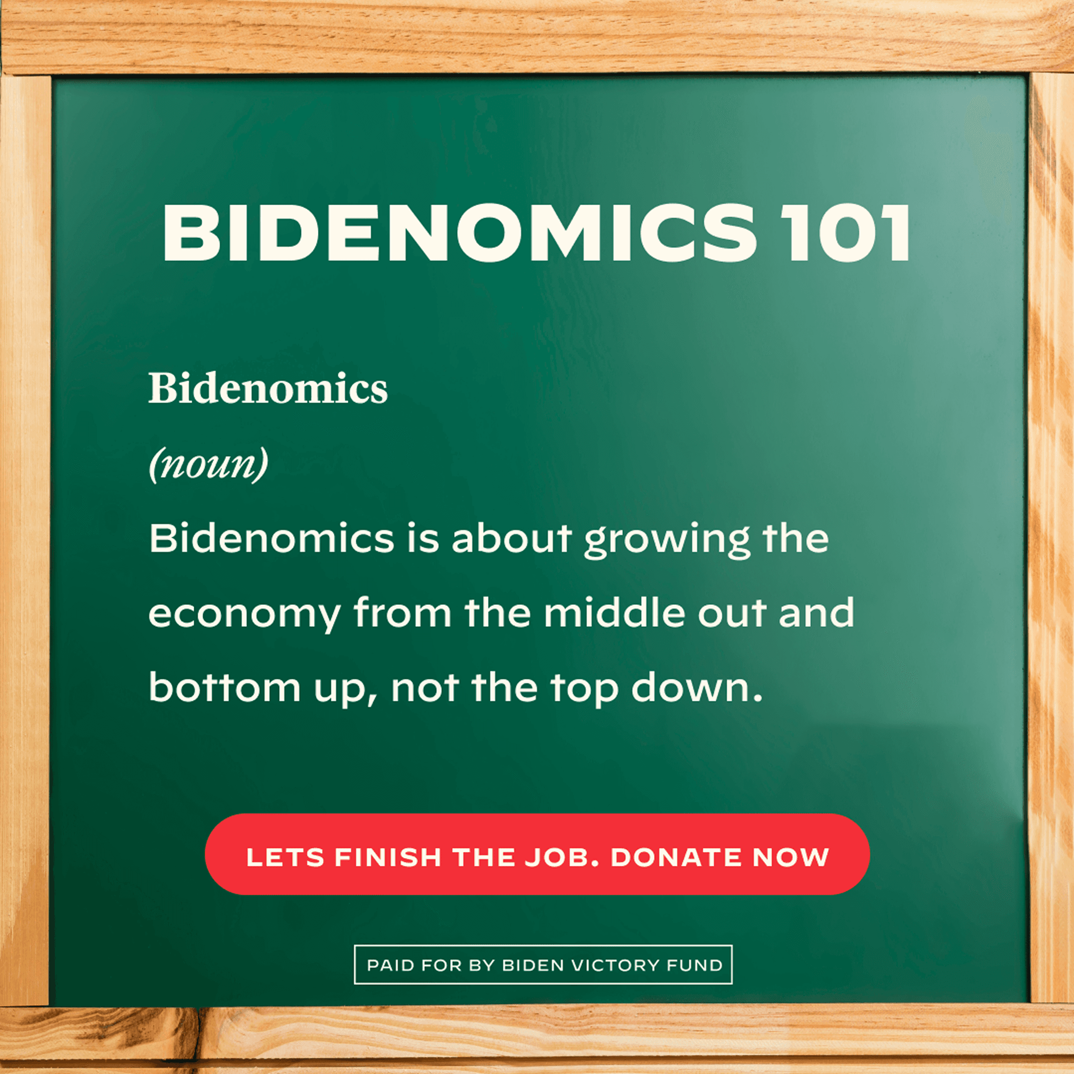
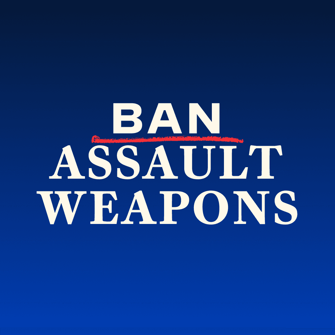
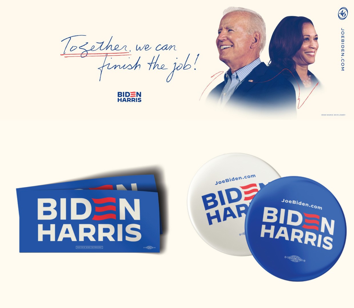
Design at National Scale
The Kamala graphic shows one project in detail. Over four months, I designed dozens more—policy announcements, campaign updates, voter engagement graphics, event content.
Below is a selection of that work.


| IMPACT
A Measurable Result
In design critiques, I quickly learned that "I think this works better" wasn't enough—the team needed rationale.
My psychology background became my strongest asset. I defended layouts using cognitive load principles—explaining why hierarchies help people process information faster. I advocated for color choices through color theory and their psychological impact on trust. I brought cultural context about the Latino-American community when discussing authentic representation.
It worked. My designs were approved more consistently because I backed decisions with evidence, not taste.
| LEARNINGS
What I'm Taking With me
This was a fast-paced, formative summer. Here are the lessons that will stick with me.
Accessibility Is a Foundation, Not a Feature
I've always cared about accessibility, but this internship showed me what it means to truly practice it. I learned that accessibility has to be built into every decision from the start. The first wireframe, the first layout, the first color choice. When it's foundational, the work genuinely serves everyone it's meant for.
Feedback Made Me a Stronger Designer
The critique process was fast and intense at first. But I learned to see feedback as collaboration. The team caught things I missed and pushed my thinking further. Learning to integrate feedback quickly made me a better designer and teammate.
Mission-Driven Work Is Where I Want to Be
This summer confirmed what I already suspected: I want to work on things that matter. Using design to help people understand voting, healthcare, and policy felt different. It wasn't just about aesthetics. It was about creating clarity and access on a national scale.

View of my walks during this internship. It was an amazing and memorable summer!

