VAROS Technologies ~ Website Redesign
User Research · UX/UI Design · Biotech startup
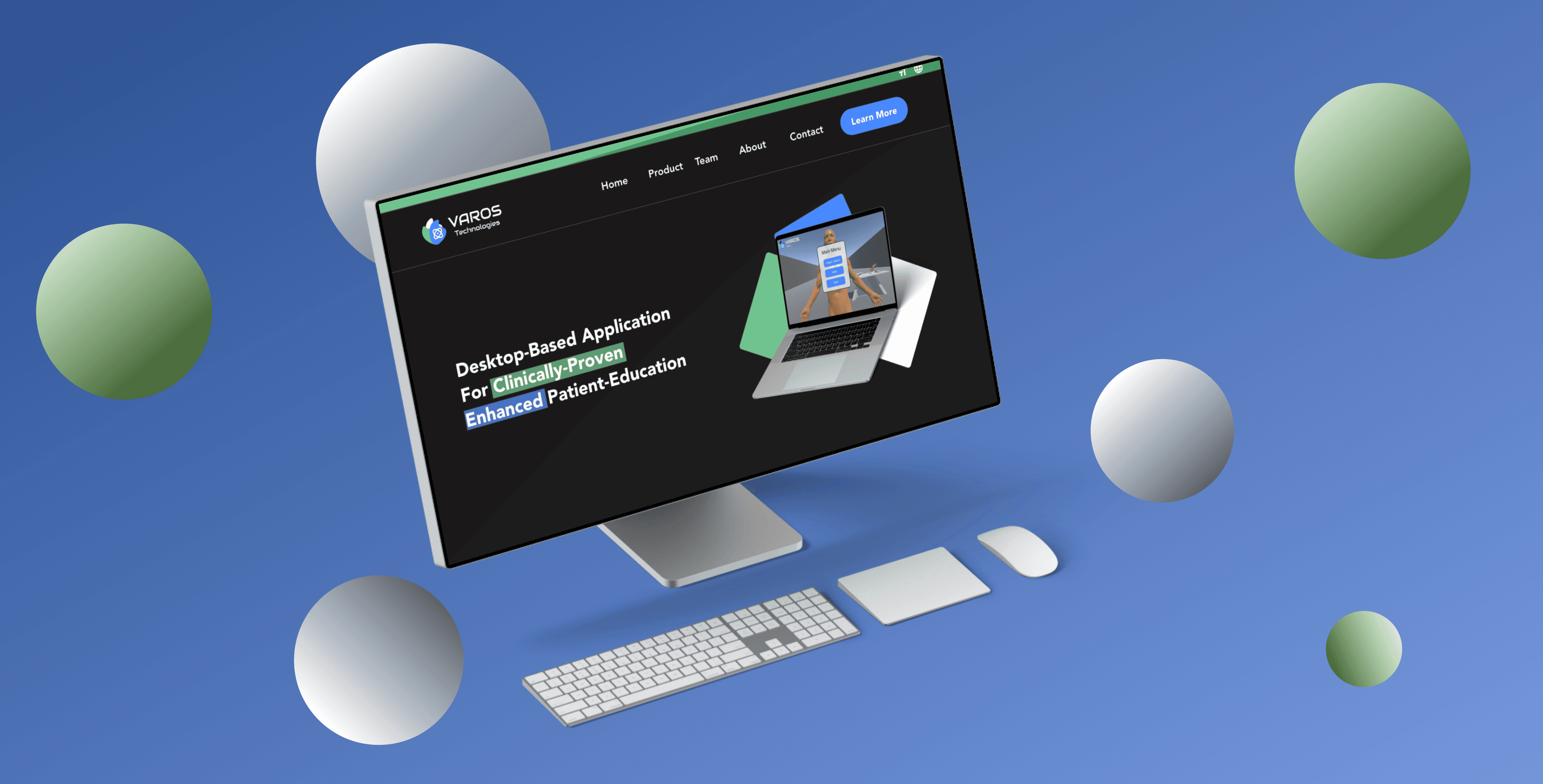
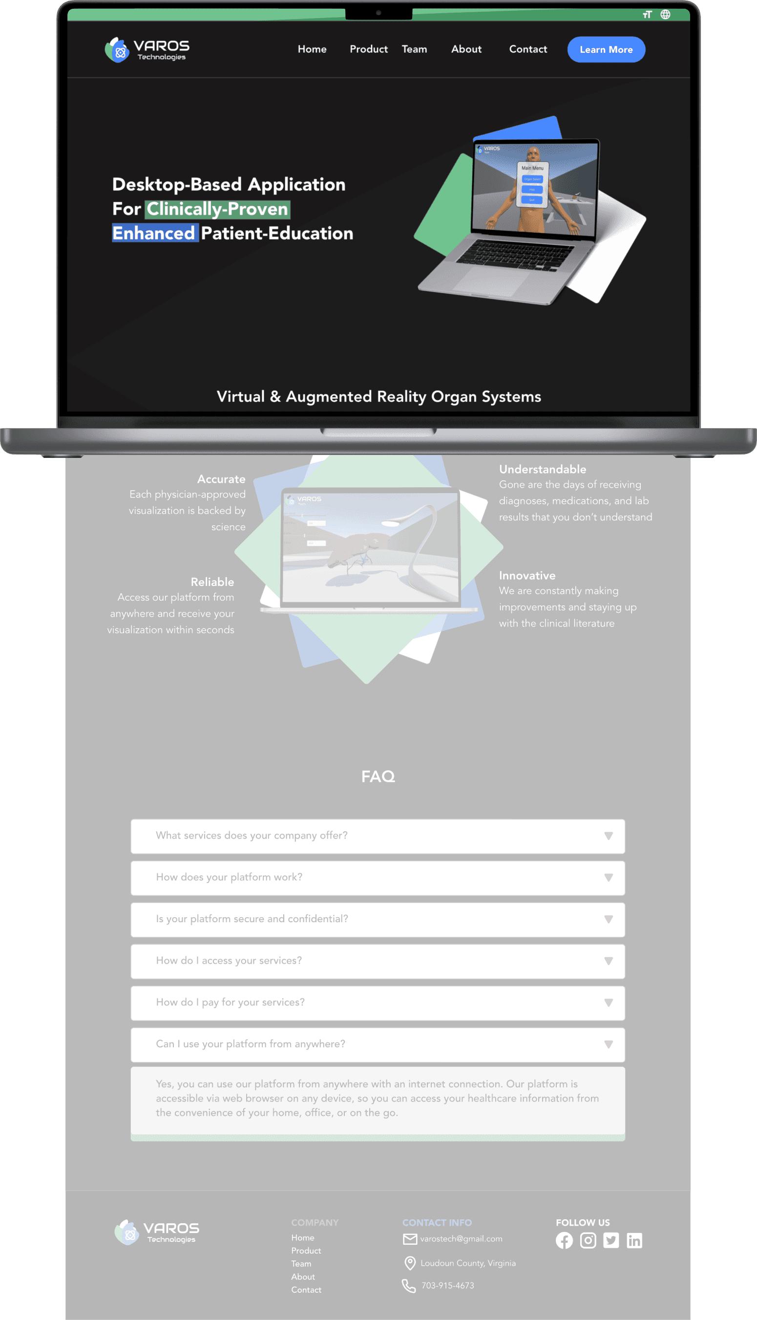

Imagine a healthcare website that's so empowering, it helps you bridge knowledge gaps and actively participate in your healthcare decisions. That's the vision behind my website redesign project. I worked with a team of doctors and designers to create a website that is informative, engaging, and accessible to all patients.
My Role
UI/UX Designer: User Research, Visual Design, Brand Identity
Product Type
Website (Homepage, Team, Product, About, Contact)
Time
3 months
Tools Used
Maze, Loop 11, Figma, Adobe XD, Photoshop, Illustrator, Webflow
What I did
Competitive Heuristic Analysis, Analysis, User Research, Information Architecture, Desktop Design, Prototype, Usability Study, Brand Image
Outcome
The current website is blocky, inconsistent, and difficult to navigate, with information that is not presented in a clear and concise way. The redesigned website should be easy to navigate, with well-organized and easy-to-find information. It should also be visually appealing and reflect the company's brand identity.
Why the redesign?
My Involvement
I'm a designer with a background in the sciences (Psychology, Biology, and Neuroscience), and I was excited to work on a website redesign for VAROS Technologies, a digital health startup focused on improving healthcare access through patient empowerment via a virtual platform.
I was contacted on LinkedIn for the project, and I eagerly took on the challenge because VAROS's mission resonated with me. I believe that everyone should have access to the information and resources they need to make informed decisions about their health.
The Brief
My objective was to redesign the biotech startup’s website to empower patients through a seamless and intuitive user experience. I focused on creating a site that was clear, easy to navigate, and visually appealing. It was important to ensure the design aligned with the new brand style, with a strong emphasis on call-to-action buttons and streamlining the contact process.
Double Diamond Approach
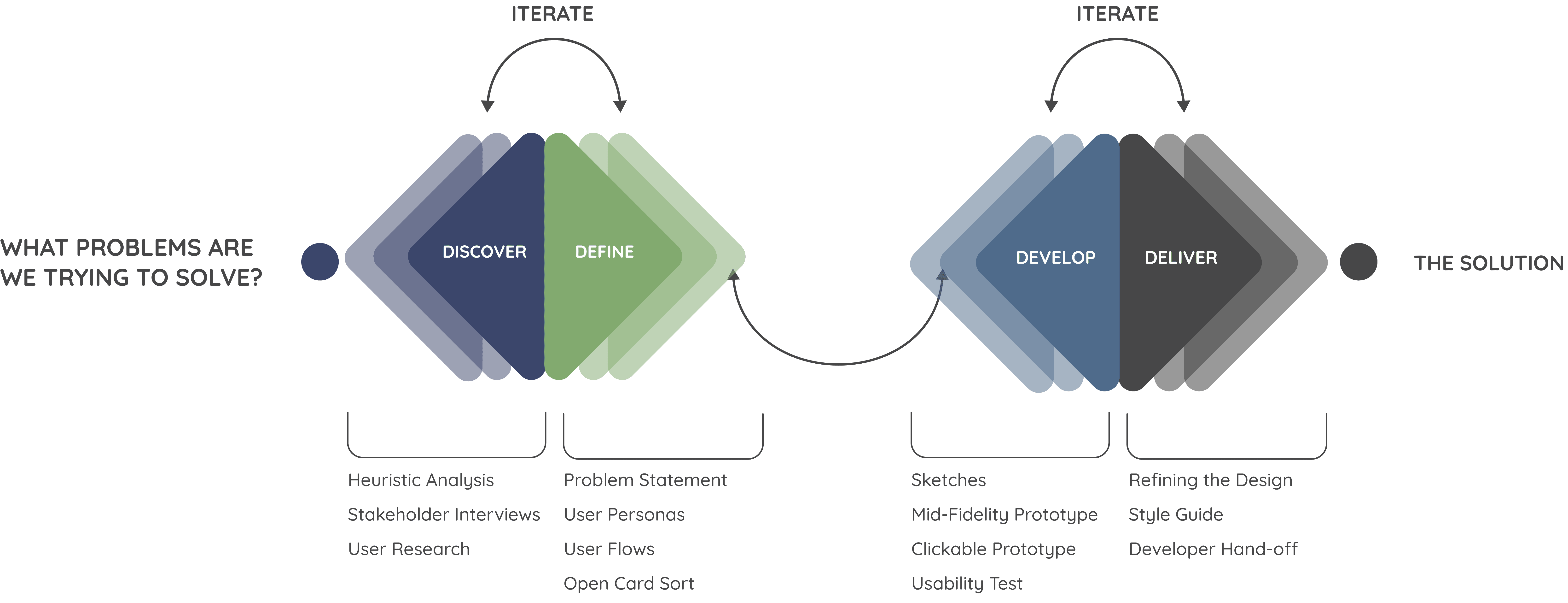
Discover
Significance & Implications
Why a strong digital presence for startups matters
Did you know that 85% of consumers research products online before buying? And that 74% of those consumers rely on websites?
This data from Salesforce research highlights the importance of a strong digital presence for startups. A professional and user-friendly website is essential for making a good first impression and attracting new customers.
Real-World Impact: Why Health Literacy is important
Did you know that 36% of US adults have low health literacy? This means they struggle with health information, leading to higher healthcare costs.
What can be done?
Provide clear and concise health information in plain language.
Use visuals and other aids to help people understand health information
How might we …
help people feel more confident when navigating their health?
Let's start finding the answers with a Heuristic Analysis!
Here’s a snapshot of VAROS Technologies’ website, presented with commentary. For this heuristic analysis, I focused on key elements like color accessibility, text styles, text dialogue, and the ability to reverse actions.
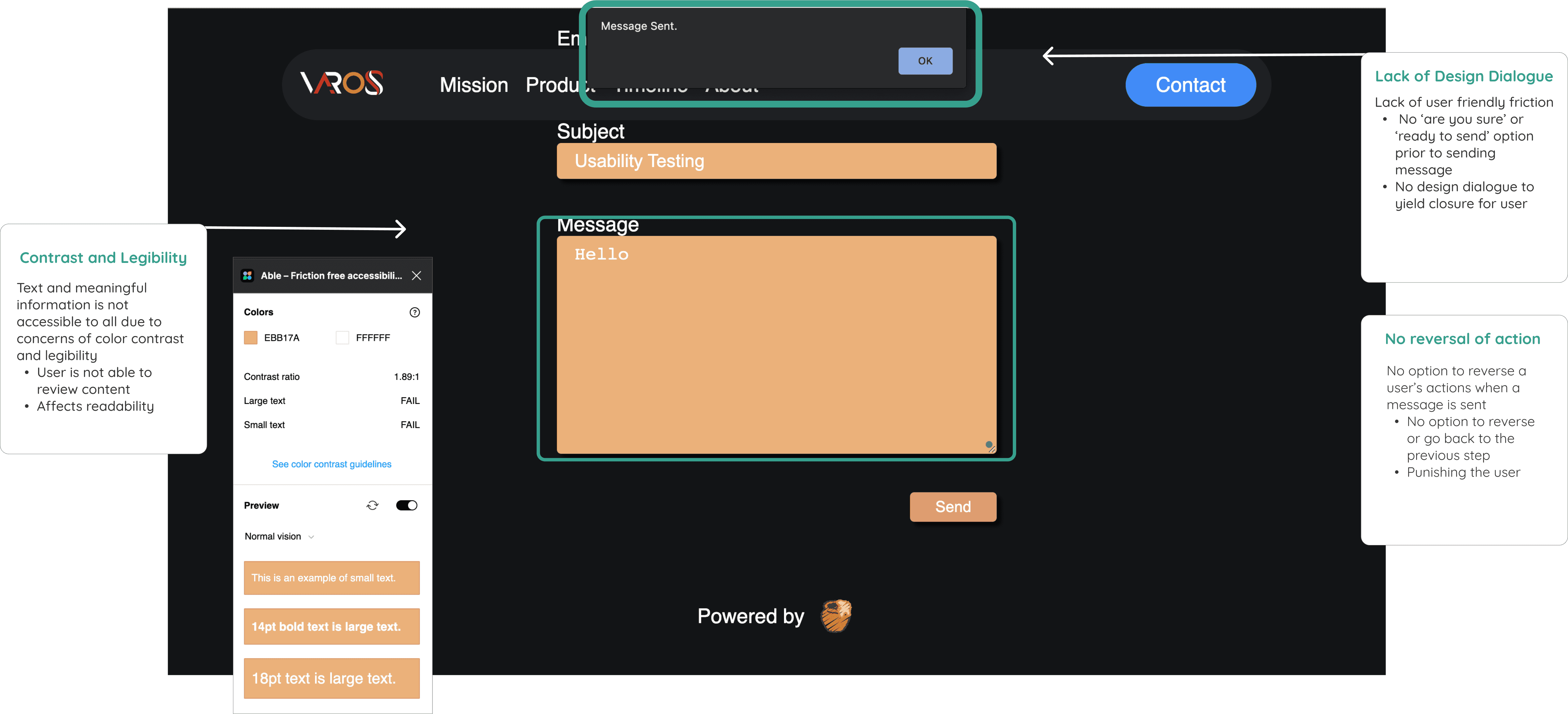
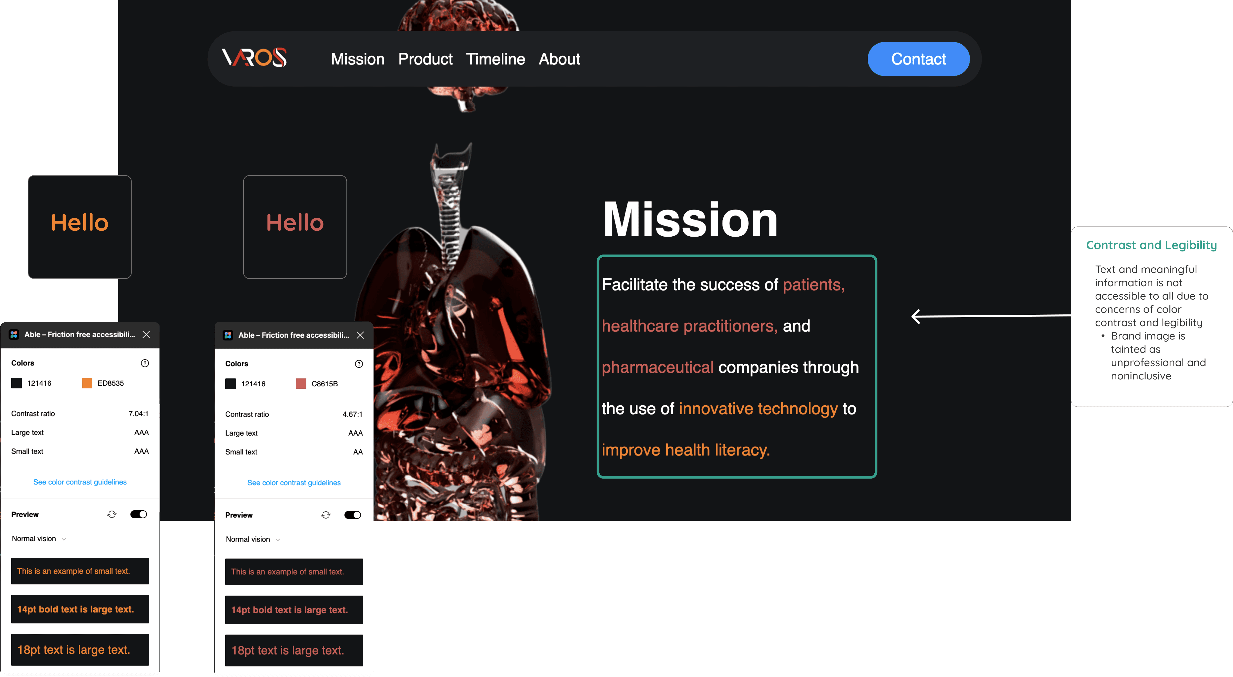
Heuristic Analysis Insights
Main Usability Issues
Too much empty space
Not visually accessible
Navigation bar is confusing
No clear call to action on the home page
No confirmation message or way to go back
"We are the medical professionals!"
Stakeholder Interviews
To better understand user needs while addressing business goals, I facilitated discussions with VAROS Technologies' executives, navigating potential stakeholder bias to maintain a user-centered design approach. A key challenge was balancing the medical jargon and extensive information that professionals deemed essential while creating an easy-to-navigate and digestible user experience.
Checking out what else is out there
Competitive Analysis
To enhance VAROS Technologies' user experience, I conducted a competitive analysis of 3D for Science and Xvision, focusing on navigation, layout, and usability. My findings from the analysis reveal key areas to focus on:
Implement standard CTA buttons
Consistent call-to-action buttons simplify user journeys and promote engagement.
Enrich product information
Offer comprehensive details about functionality to empower informed decision-making.
Address user queries
Create a readily accessible FAQ section covering both product and company-related inquiries.
Optimize information access
Streamline the process of finding product details and submitting contact requests.
User Research
Could you walk me through the process of how you navigate health literacy in healthcare?
I spoke with five patients, each with different levels of tech-savviness and doctor-patient interactions, to learn more about their experiences with health literacy and how they use apps and websites to manage their health.
I wanted to understand:
What challenges do patients face in understanding and using health information?
What kind of health information do patients need to make informed decisions about their care?
By learning more about patients' experiences, I can help to develop solutions that make it easier for everyone to understand and use health information.
What did users have to say?
Evan, EMT & College Student
“Clear communication and transparency with doctors and nurses is a must. I need to know what is going on with my physical health”
Narciza, Grandmother
“In my experience, one of the obstacles in healthcare is the cost. It’s important that there are plans that are financially feasible for me”
Lidia, Practicing Nurse
“ I want a healthcare provider that is approachable and friendly”
Define
Moving Forward
After research, it became clear that people have:
Different reasons for choosing a healthcare provider
They want clear and honest information about their care.
They want to feel comfortable and supported by their provider.
They need reassurance and support during difficult times.
Problem Statement(s)
I revised my problem statement to align with the evidence-based users’ needs and goals
Original:
Patients need accessible and easy-to-understand information about their health to feel comfortable and confident during their emotional experience of medical care.
Revision:
Patients need support and clear communication to better understand medical information, address their health literacy concerns, and feel empowered throughout their medical care journey.
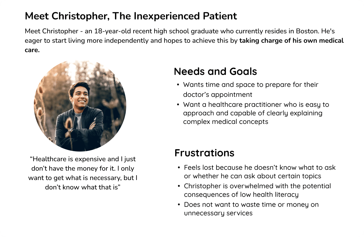
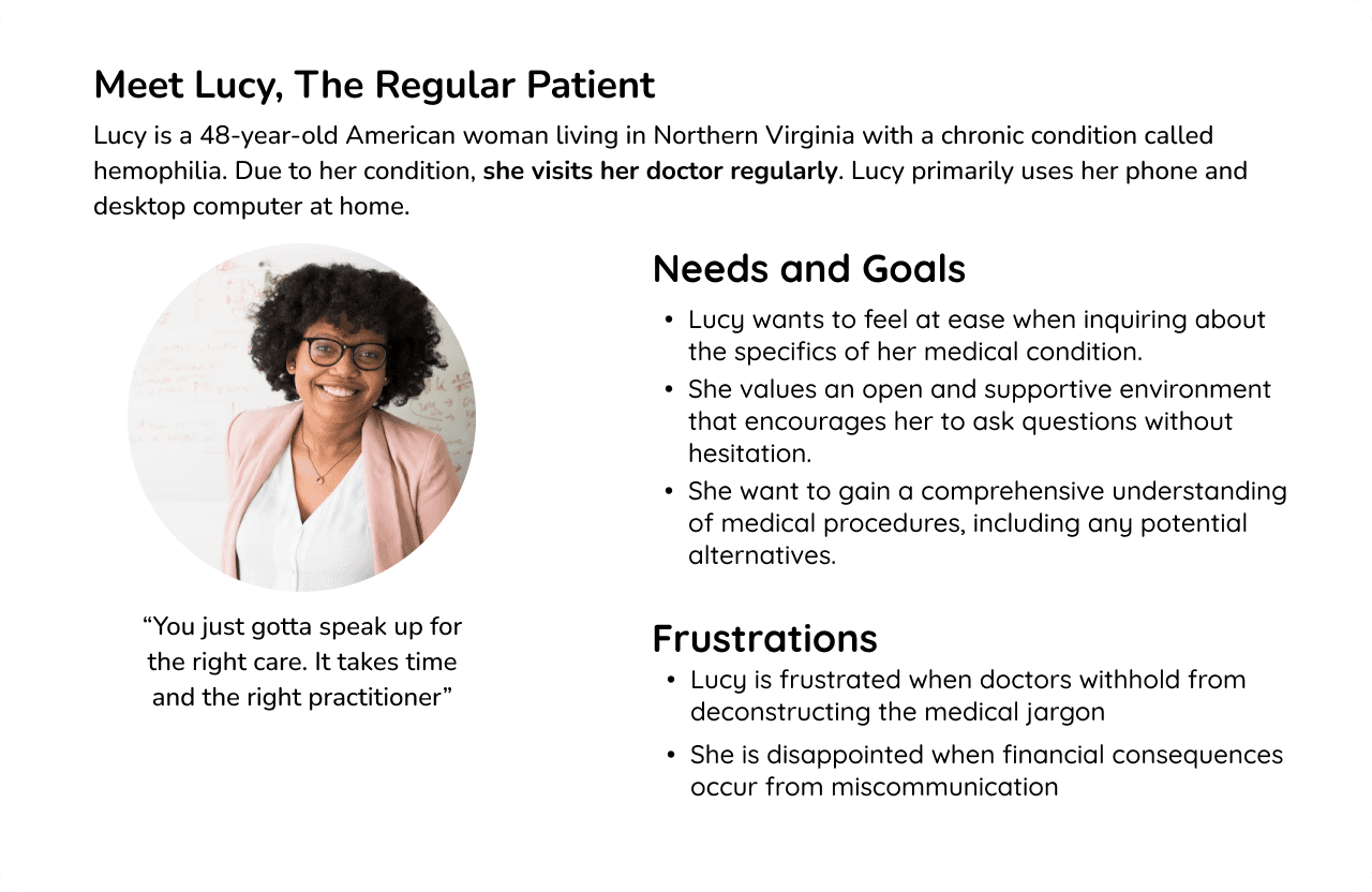
Through conversations, I clarified the scope of the project, and as a result, I was able to create distinct user personas
Regular patient
Experienced individuals who take an active advocacy role in their healthcare interactions.
Inexperienced patient
Individuals with limited healthcare experience who may benefit from health literacy assistance.
Medical practitioner
Healthcare providers who aim to effectively communicate medical information to their patients.
User Journeys and User Flow
How would Christopher go about finding information about a virtual health literacy tool within VAROS Technologies' website?

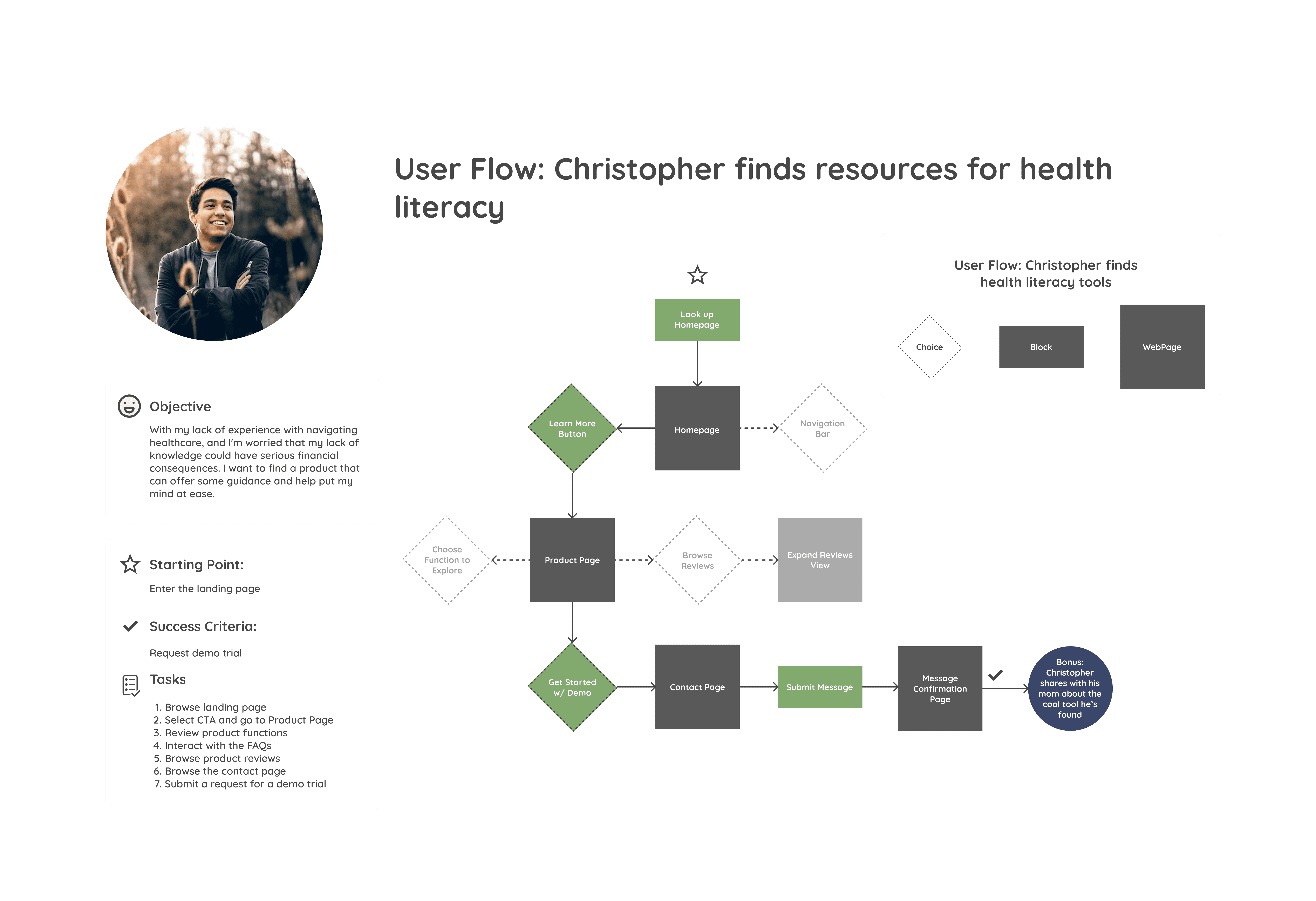
Centering it back on to Objectives
How do we best create a user-friendly platform for health literacy?
I identified the website's key feature gaps based on user research: Inefficient contact pages and a lack of product breakdown
Prominent call-to-action (CTA) landing page to direct users to product information.
A key question to address is: How can we create a website that helps users feel at ease while providing a positive experience with our primary product?
Contact button in the navigation bar for an easy demo trial or contact request.
Inclusion of the startup's objectives in the "About" page for transparency and trust-building.
Honing it down w/ Site Maps and Card Sorts
How can we create a website that helps users feel at ease while providing a positive experience with our primary product?

Develop
Time to start creating
To meet the needs of both the business and users, I started by creating sketches, wireframes, and a prototype for the website re-design
Prototypes
After the drafts of sketches and wireframes, I was set to create the final designs and prototypes for the website re-design. Check out how they turned out
Refining with Usability Testing
I conducted a moderated usability study with 5 participants (3 new patients, 1 medical student, and 1 health practitioner)
Customer Reviews Section
The customer review section had a flat design with readability issues, especially for small or unclear text.
Some users zoomed in or expanded the section to improve readability.
Request Demo Form
Participants found the demo request option unclear.
Deliver
Style Guide
Colors that are regularly associated with the medical field and invoke a trusted and calm emotional journey
A modern, clean aesthetic with a cool color palette that aligns with VAROS' blending medicine and technology

Outcomes and Results
Distinctive pages to prevent information overload
User-friendly interface, personalized meal-prepping options, and social features.
The variety of healthy recipes and customization options were appreciated.
Cohesive and inviting brand identity
More social features and a simplified recipe rating system.
Intuitive and accessible design
A cohesive and visually appealing design.
Learning & Challenges
Reflection
What made this project truly memorable was the collaborative aspect of the design journey. Getting to work with engineers, medical practitioners, and artists was such a fulfilling experience. I learned so much about the design constraints developers face and gained a new perspective on the user journey through a doctor’s lens.
On top of that, crafting a startup’s brand style was uncharted territory for me, but it was such an exciting challenge! Exploring my creativity in a new way and helping stakeholders shape their vision for the company was both rewarding and inspiring.
I'm particularly excited about two features that I'm working on such as a section that educates users about health literacy and how VAROS Tech products can help them achieve their health goals. Additionally, adding an accessibility settings screen that gives users control over their experience to allow users to customize the font size, color scheme, and other features to meet their individual needs.
The Democrats ~ Biden Administration
Graphic Design · Political Campaign
Forge UX Academy ~ Mealy Case Study
Mobile App Design · User Research