TLDR
Travelers were getting lost.
Travelers using PROS Fare Finder didn't know where they wanted to go — and the map wasn't helping them figure it out. We redesigned the experience so exploration felt possible, not paralyzing.
ROLE
UX Design Intern
TIMELINE
Jun – Sep 2025
TEAM
Johanna Huarachi
Brooke Mellish
Valerie Rieger
SKILLS
UI/UX Design
A/B testing
Design Strategy
PROBELM
A map with nowhere to go.
Fare Finder is for the traveler who doesn't know where they're going yet — open budget, open destination, just looking for something worth booking. The map was supposed to make that feel easy.
But it had no geographic context. Users couldn't orient themselves, and without that, exploration wasn't possible. Most left without a flight.
RESEARCH
60% of users hit the same wall.
Five user interviews. The same moment, over and over — users opened the map, didn't know where to start, and never recovered from that first hesitation.
Open-ended exploration only works when people feel grounded enough to explore.
3/5
Experienced usability and navigation issues
"It takes a bit to get comfortable using it and not getting lost."
— Traveler 1
"I couldn't find my preferred destination… I probably would have abandoned the page."
— Traveler 2
2/5
Asked for country lines on the map
"This could be confusing for people who don't know their geography — there are no country lines."
— Traveler 3
*Hover over to zoom

CONSTRAINTS
The first fix was off the table. So we changed the question.
Two of five testers asked for country borders. It made sense. If users couldn't orient themselves on the map, adding geographic labels would give them a reference point.
Before opening Figma, we looked into it. PROS serves international airlines operating across regions with disputed borders and contested geographic labels. There is no single version of a world map that works for every carrier and every market they serve. After speaking with the PMs and UX Strategist, we learned that country lines were not something the product could standardize across its client base.
So the question changed. Not how do we show geography, but how do we build orientation without it.
SOLUTION
The solution was a system. Here's how it came together.
Country borders were off the table. So the question became how do you help someone orient themselves on a map without geography. The answer wasn't one fix. It was three components, each serving the open-ended traveler at a different moment.
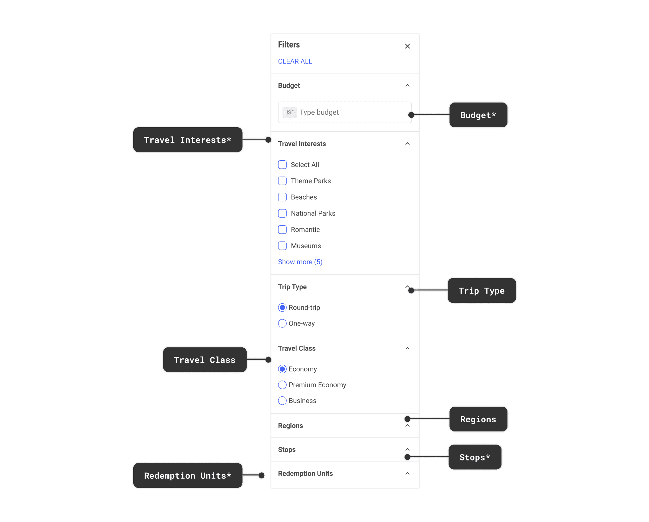
1) Filter Panel

Before
After
The original map had a row of dropdowns at the top. Departure, Budget, Travel Class. Filters that assume you already know what you want. Most Fare Finder users don't.
We redesigned it as a dedicated side panel organized around how open-ended travelers actually think. Not just budget and class, but Travel Interests like beaches or national parks, and Regions to narrow by where in the world. Start with what you care about. Let the map respond.
Breaking down the new Filter panel
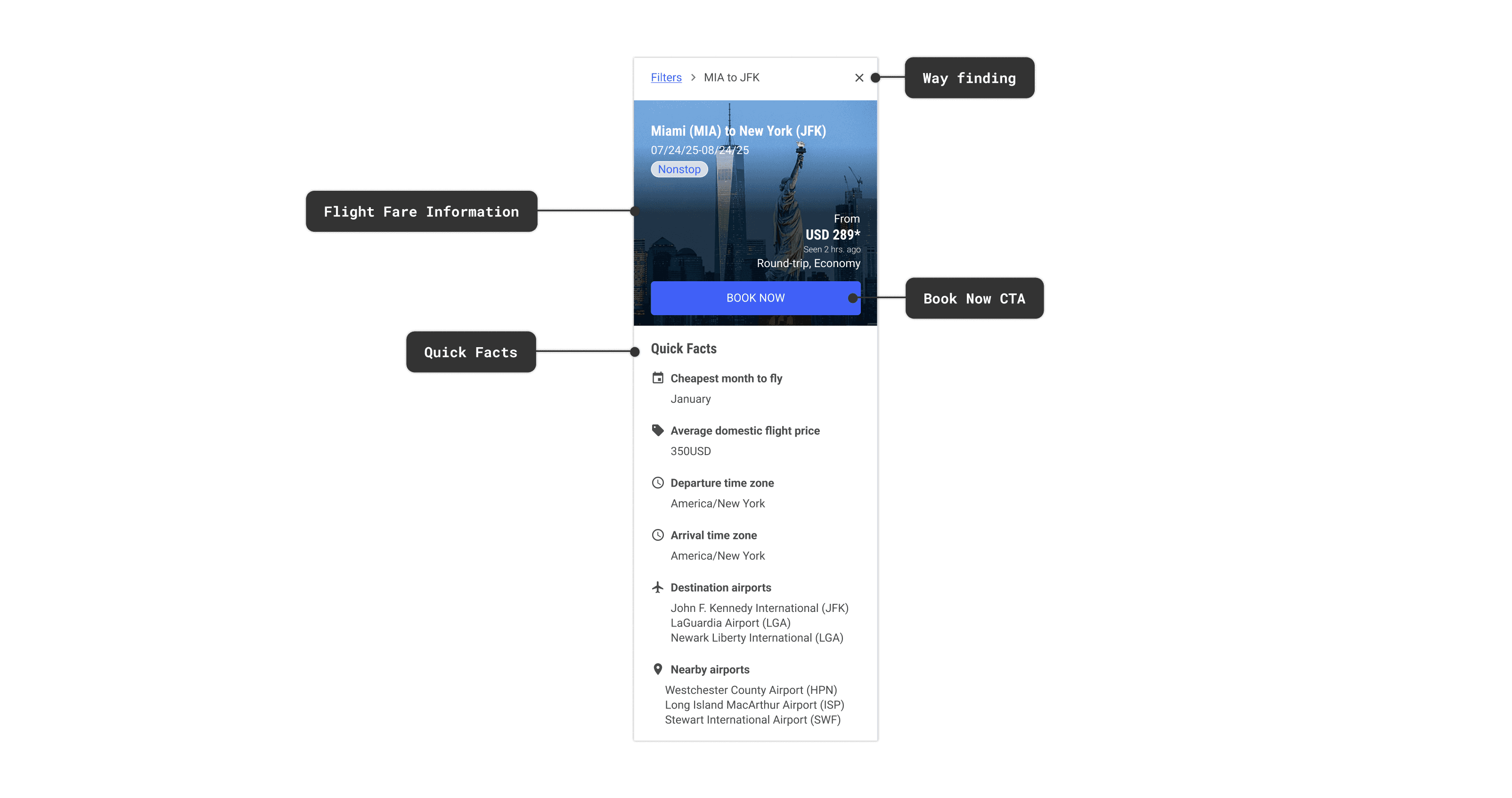
2) Flight Fare Card
The old experience was a pop-up. Route, price, Book Now. Built for someone ready to book, not someone still deciding.
Fare Finder users are still deciding. So we explored layouts that could do more -- answer what the destination looks like, when the cheapest time to go is, what airports are nearby. The kind of information that helps someone commit to a place, not just a price.
Before
After
What we explored
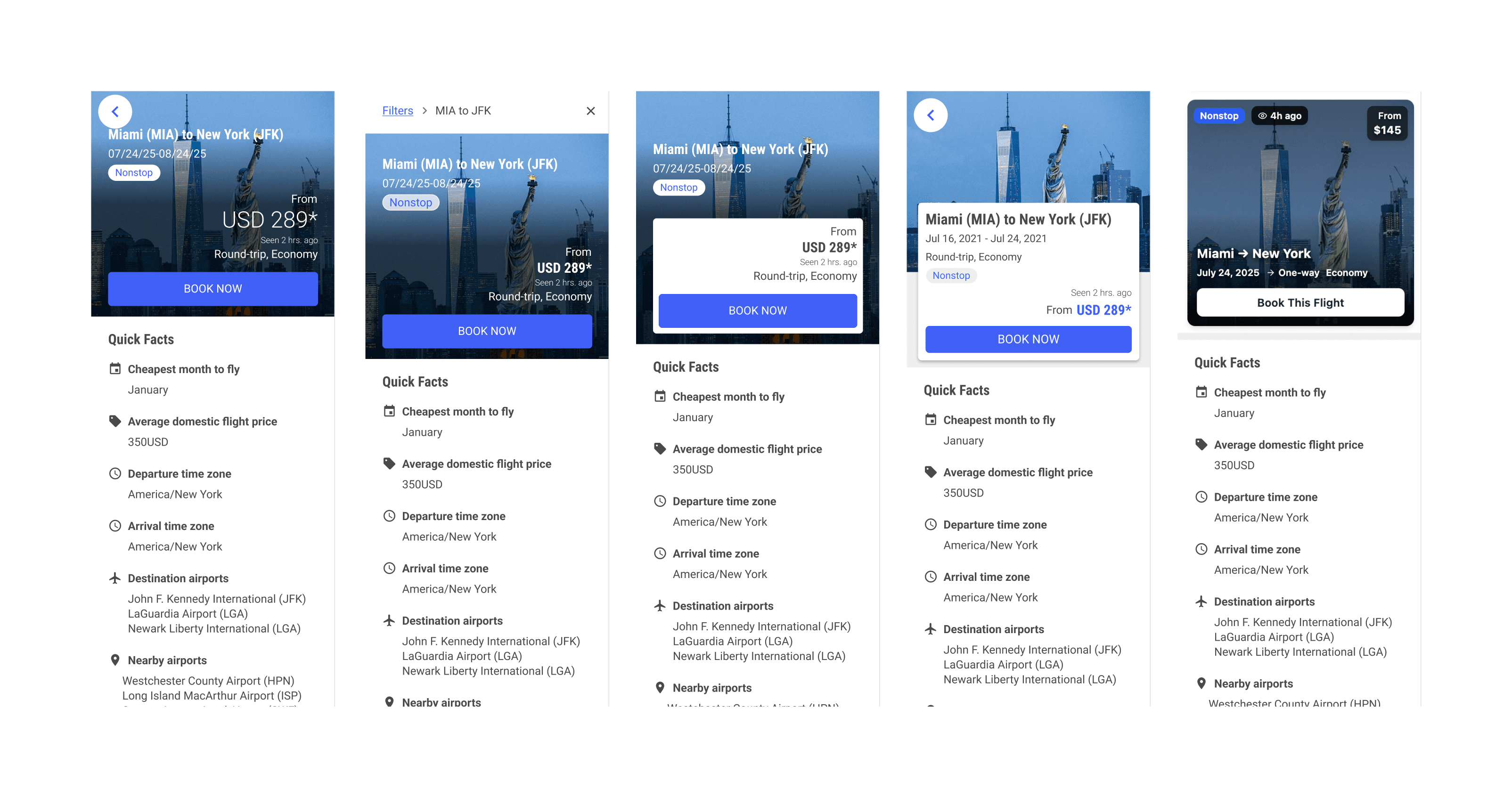
What the partner chose
*The airline partner chose the layout that kept users oriented even inside the panel. Breadcrumbs so you never lose track of where you came from. A clear CTA when you're ready. Quick Facts to support the decision without forcing it.
3) Flight Recommendations
Recommendations existed in the original experience. In the non-fullscreen view, a sidebar surfaced popular destinations from the user's origin. But the moment a user went fullscreen to explore the map, the sidebar disappeared. The traveler who needed recommendations the most lost access to them entirely.
Default vs. fullscreen: the recommendations that disappeared
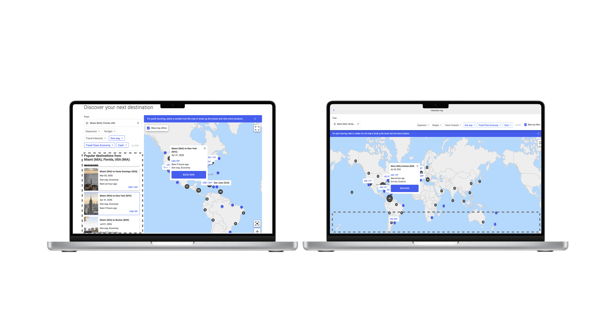
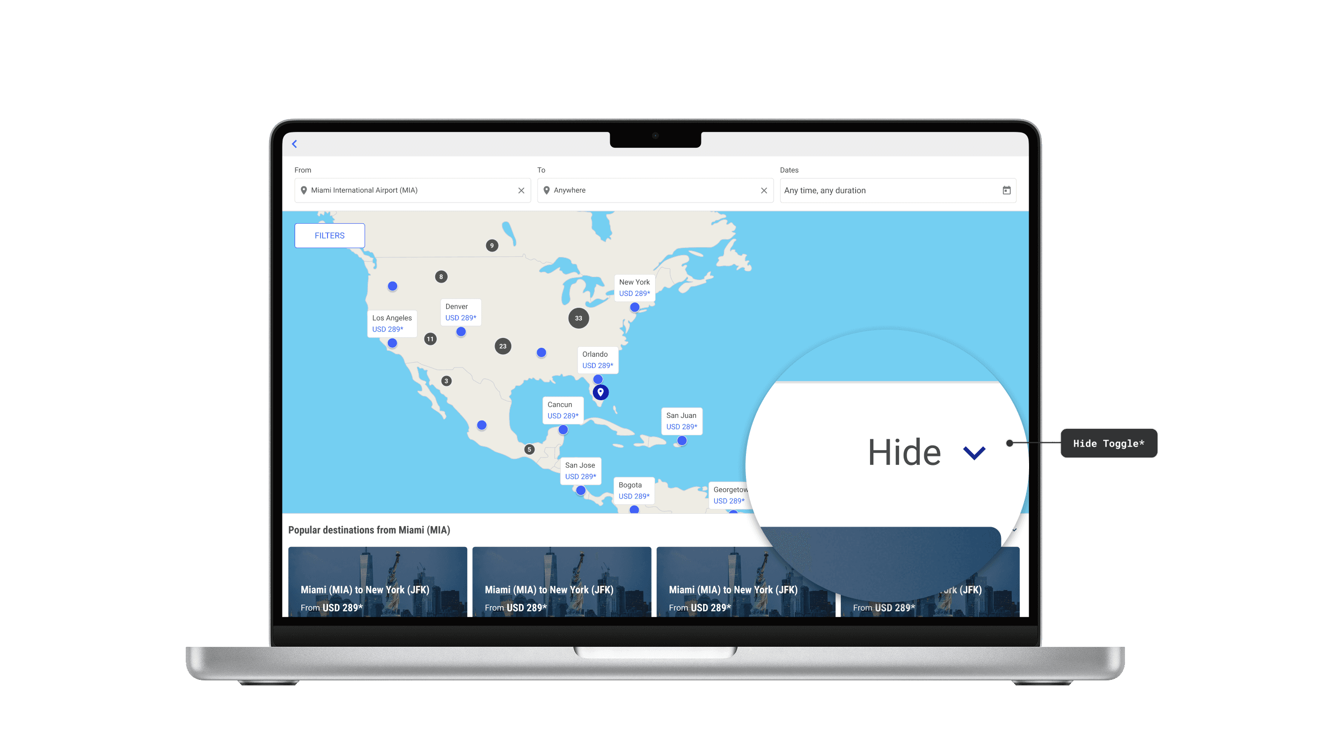
We introduced bottom cards to bring recommendations into the fullscreen map experience. But adding cards created a new problem. They competed with the map for space. Full Cards kept them large and fixed. Compact Cards reduced the size but cards were still always present. Neither gave users any control over what was taking up their screen.

Compact
Full
Collapse
The direction that gave users control
Collapse Layout was my suggestion. Hide the cards to explore the map freely. Bring them back when ready to book. It turned a fixed UI element into something users could control. The airline partner chose it because it gave users the most control over the interface. It's the direction that shipped.
NEXT STEPS
Validated, then handed off.
We presented all layouts to a key airline partner and they chose the Collapse layout. They confirmed the direction — and surfaced two things we hadn't designed for yet: filters for promotional fares, and surfaces to highlight specific routes.
My internship ended before I could build them. I documented the path forward and left a roadmap. The feature shipped in January 2026.
✦ As of January 27, 2026, the premium Fare Finder map feature is live.

Promotional Fares
IMPACT
What landed.
Root cause found
5 user interviews revealed that 60% of users were hitting the same wall for the same reason. The map gave them no way to orient themselves.
Direction validated
Collapsible Cards went from concept to airline-partner sign-off. The product launched in January 2026 as the premium Fare Finder map.
Roadmap handed off
I couldn't finish everything before leaving. I documented what was left and handed it off. The team picked it up from there.
Before and after

What I'd carry forward.
The obvious fix is worth questioning.
Testers asked for country borders. We asked why before designing anything. Turns out it was off the table entirely. That one conversation saved weeks on a solution that was never going to ship.
Psychology isn't a soft skill.
My psychology background shaped how I thought about the map experience. Understanding how people process information and make decisions made some of the design calls feel more intuitive.
Prototype behavior, not just visuals.
I used Figma Make and Claude to build functional prototypes instead of static screens. It changed the quality of feedback. The team could react to how something worked, not just how it looked.


Brainstorming Sessions
ALSO AT PROS
Revenue Management AI Platform
Post-COVID, 40–50% of airline analysts were newcomers. The platform was built for veterans. I worked with the UX team on strategy and AI integration — designing features that were meaningful to both.
